Form, Function And The 50-State Quarters
By Leon Worden
COINage magazine
December 2005
| I |
And the coin program has been a smashing success in spite of it. Some would even say because of it.
The 50-state quarter program has invigorated the hobby of coin collecting and the business of numismatics at a time when both ailed from a lack of new and different circulating Mint products to stir the public's interest.
Before the program started in 1999, an estimated 3 million to 8 million Americans were actively collecting coins. By 2005, based on independent market research conducted for the Mint, 140 million Americans — one of every two men, women and children — were at least looking at their pocket change and setting some of it aside.
Quarter for quarter, the coins have meant billions for the nation's Treasury. Two-thirds of the way through, the 10-year program has already topped the high end of the $2.6 billion to $5.1 billion projection for indirect earnings through seigniorage — the difference between the 7-cent-per-unit production cost and the 25-cent face value.
Best of all, it's fun. It's fun to try to assemble a complete set of quarters as they're issued — and for many people, it's a source of pride to come across a coin honoring one's home state.
The biggest winners are America's school children. Not only do the quarters introduce them to a hobby they can carry into adulthood, but the youngsters also learn geography lessons when their teachers use the coins as instructional tools.
|
|
"Dick Armey was [House] majority leader at the time," Castle told COINage recently. "He was skeptical about it. Now he's left Congress. He's a lobbyist now, I guess.
"I saw him a few weeks ago. He said his grandson didn't have a Delaware quarter, and could I help him get one? It's funny to have Dick Armey engaged in this coin collecting thing."
For all its pluses, the coin program has drawn fire on its finer points — particularly, lack of consistency in the quality of designs. Somehow, the same coin program that has graced the nation with Connecticut's majestic Charter Oak and Rhode Island's graceful sailboat has also been responsible for trite renditions of Wisconsin cheese and a blobular map of Michigan.
Discriminating numismatists whose collections include examples from the halcyon days of American coin art — perhaps a 1913 Type 1 Buffalo nickel from James Earle Fraser or, for the lucky (and rich), a high-relief $20 gold piece from Augustus Saint-Gaudens — often lament the Mint's failure to hit an artistic home run every time out.
"The thing everybody raises is Saint-Gaudens," said Mint spokesman Michael White. "Of course, we're not in that era any more."
"We certainly aren't in the art nouveau style and period any more," said key observer Donald Scarinci, "but the art of our time is as vibrant and alive as the art of that time. The art needs to reflect its time, and the art of our coins needs to reflect the greatness of our country."
Scarinci, a New Jersey attorney and specialist in medallic art, is the newest member of the Citizens Coinage Advisory Committee (CCAC), a group of artists, numismatists and public advocates who advise the Treasury Department on all new coin designs, including those of state quarters.
Criticism of new coin designs is nothing new. Consider this: "The long line of monstrosities issued from the United States Mint certainly receives its crown in the new dollar."
Which dollar? The Susan B. Anthony dollar that the public vilified? Or the Sacagawea dollar that the public ignored? No. This was an editorial opinion in the April 1878 American Journal of Numismatics, and the dollar was the Morgan dollar — regarded today as one of the classiest American coins. (Thanks to Q. David Bowers for including the quotation in his book, "Morgan Silver Dollars: A Complete History and Price Guide," Whitman Publishing, 2004.)
If you're looking for consistency in the 50-state quarters, Scarinci advises, look to the obverse (the "heads" side). The portrait of George Washington doesn't change from coin to coin.
As for the designs on the reverse (the "tails" side), well — that's one big way this coin program is unique. The designs aren't really up to the Mint. By the time the program is finished in 2008 (with a possible extension to include the District of Columbia and the U.S. territories), there will have been at least 50 different processes for determining what goes on the quarters — a different one in each state.
"The state process, the Mint does not dictate," said Gloria Eskridge, associate Mint director for sales and marketing. The state quarters fall under her purview.
"We in no way have restrictions on how [the states] come up with their three to five [designs] that are then turned into the United States Mint."
Once they're turned in, the Mint renders them for "coinability" (more on that later). It then runs them by the CCAC and the national Fine Arts Commission and returns them to the state governors for their final selection.
"The charm of the series is that each one of these quarters is different," said Scarinci. "Each one takes on some expression that people within that state felt they wanted to communicate to the rest of us."
"Involving the public is the greatest thing you could ever do," said David L. Ganz, past president of the American Numismatic Association, whose incessant drumbeat for circulating commemorative coins in the 1990s changed minds and opened doors for the 50-state quarter program.
"The people of a particular state always have a better sense of what's important [to depict] than someone sitting in Washington or at the Mint."
Nonetheless, the Mint has some changes in store in the design department. Beginning with the 2006 designs, the Mint is "infusing" the program with artists from outside the Mint's walls — professional and student artists who have been selected to participate in the Mint's Artistic Infusion Program.
"I think we always want beautiful designs for our coins," Eskridge said when asked whether the involvement of AIP artists reflects a conscientious effort on the part of the Mint to improve the quarter designs.
AIP was initiated in 2003 by former Mint Director Henrietta Holsman Fore to, in her words, "invigorate the artistry of coin design in America." Following a "call for artists," the Mint and the National Endowment for the Arts in February 2004 selected 18 professionals in varied media from around the nation, along with six college students as apprentices. In April 2005 the Mint added three more: two professionals and a student.
To date, these outside artists have submitted designs for non-circulating collector coins as well as the two different 2005 Jefferson nickels. The Mint credited AIP artist Joe Fitzgerald of Silver Spring, Maryland, with the new obverse image of Thomas Jefferson and with the reverse of the "Ocean in View" nickel (which he adapted from a photograph by Andrew E. Cier of Astoria, Oregon). It credited AIP artist Jamie Franki of Concord, North Carolina, with the American Bison design.
Eskridge wouldn't identify AIP artists whose designs ultimately may have been selected for 2006 state quarters. (Designs are developed well in advance of release.)
To Scarinci, who thinks the 2005 nickels are "very creative" and "very pretty," the big benefit of involving AIP artists isn't necessarily what they'll do for the 50-state quarters. Rather, it's what their involvement in the quarters will do for other coin programs when the Mint's five sculptor-engravers no longer have to spend so much of their time on rote tasks such as executing other people's quarter designs.
"Many hands make light work," Scarinci said. "On the quarters themselves, I don't think they can do very much. They're given the design. ... It's [like] Franklin Mint artist series medals where — 'Here's the painting, copy it. Here's the design, do it.' That's not allowing them creative expression."
|
|
"All of the [Mint's] sculptor-engravers are talented and ... have the capability of doing great art," Scarinci said. "[Their critics] are unrealistic to think they can do all of the routine things they need to do, and then, between midnight and 6 a.m., get a creative flash and produce beautiful art. It's impossible. Impossible. Now, with a lot of people doing it, they have a little more time."
"One thing's for sure," Scarinci said. "If you always do what you always did, you always get what you always got. If you try something new, then you'll get something new. And that's what lies ahead of us."
It will take the careful researcher 100 years hence to figure out who came up with each state quarter design — at least, those from 1999 to 2005, before the "infusion" artists came aboard. With so many commissions and committees and governors and voters giving their input, the Treasury Department, for the first time in history, has fully institutionalized and depersonalized design selection.
It's not like there is a Charles Barber to blame for a repetitious set of coins at the turn of the last century. True, even George Morgan's final design was not entirely his own; there have always been Mint directors and Treasury secretaries insisting on modifications. But when Morgan's coins rolled off the presses, there was enough of the artist left in them to correctly call them Morgan dollars today (even though they weren't called that at the time).
The future numismatist who looks at the 50-state quarters will find various sets of initials and will be able to match them up with the corresponding sculptors' names in the official Mint records.
Investigating the "WC" on New Hampshire's coin, he might be inclined to call it the "Cousins quarter." But he'd be wrong. Sure, William Cousins sculpted it. But it wasn't Cousins' fault that New Hampshire is represented by a rock formation called the Old Man of the Mountain, which might work on a dollar-size coin but is indecipherable on a tiny planchet less than an inch in diameter. Rather, it's the fault of state officials who insisted that the Mint use the rocky icon — which collapsed in real life soon after the quarter was issued.
In 2005 we know it would be inappropriate to blame Mint sculptor Donna Weaver for Ohio's "hangman" quarter, where a spacewalking astronaut appears to be suspended by the neck from a rope which is actually part of the state outline. But what would anybody in the year 2105 know when he or she sees "DW" on the coin?
And yet it would be nearly as wrong for our future numismatist to overlook altogether the artistry of the individual Mint sculptors, precisely because the Mint has chosen to credit them — and no one else — for the coin designs.
If our future hobbyist takes a magnifying glass to Weaver's Tennessee engraving, he might assume that musicians back in the early 21st Century played five-string guitars at the Grand Old Opry.
"If you drew it with the right number of strings," said White, the Mint spokesman, "it would look fat and out of proportion." A good Mint engraver can render it within the coin's tiny design area, he said, such that "when you hold it in your hand and look at it, it looks like a guitar."
Be honest, dear reader. Did you notice without being told?
Shawn Stookey is the Tennessee artist who submitted the winning "Musical Heritage" design to then-Gov. Don Sundquist. A small-town elementary school teacher, Stookey is one of the few original-concept artists to be recognized on the Mint's Web site, if not on the coin itself.
For backers of the Mint's "horse-designed-by-committee" process, somebody such as Stookey is a shining example of everything that's right about the program.
Stookey wasn't out for the glory. He was showing his fourth- through eighth-grade art students how to submit sketches for the Tennessee quarter, which they did, and he created his own design as an example for them to follow. And when the classroom artwork arrived at the state capital, there was a mechanism in place — in this case, the Tennessee Fine Arts Commission — that enabled Stookey's design to rise to the top.
Massachusetts took the "kids in coins" concept to new heights when Gov. Paul Cellucci limited the design contest to the state's schoolchildren. Kathleen Raughtigan, a sixth-grader at St. Bernard's Elementary School, and Xander Kotsatos, a seventh-grader at Belmont Day School, submitted the winning "Minuteman" design. It was reviewed by a 10-member state panel, by the Fine Arts Commission and by the CCAC's predecessor (which added the relief to the state outline map) before being executed by Mint sculptor Thomas D. Rogers.
"What a great concept, for a kid to be able to design a coin," said Ganz.
Reaching out to kids was no accident. Castle's legislation stated: "The Congress finds that it is appropriate ... to promote the diffusion of knowledge among the youth of the United States about the individual states, their history and geography, and the rich diversity of the national heritage."
Taking the next step and allowing state residents to vote on the designs gets them involved in their coins, Castle said. "I just think it's fun. I think a governor would be foolish not to do it [have a public vote]."
Living through the program as it's unfolding, with new quarter designs yet to come, it makes sense that today's critics would scrutinize each new coin as it's issued. But how will our future numismatist see things, decades after the program is finished? Will he see 50 stand-alone items, or a single concept with 50 parts? A greater whole?
"Part of the strength of the 50-state quarters program is that when it's completed, you will have 50 individual messages forming a framework for the United States," said Garrett Burke, creator of the initial California quarter concept. "To have my name attached to it — I don't know if I could ever top it."
Burke is the rare artist who doesn't mind that his name isn't physically "attached" to the coin. Nor did it bother him when the Mint dramatically altered his work. He said he welcomed the changes.
|
|
"We need to have designs that can be mass-produced," said Mint attorney Jean Gentry who, with Eskridge, serves as a liaison to the state governors' offices. "A simple design is generally better than a complicated one."
White, the Mint spokesman, elaborated.
"The simpler the design in general, the better. Don't have too many layers; you don't want to go too close to the edge of the coin with the design; you don't want an incused [recessed] design; avoid too much small detail. We analyze the relationship between the obverse design and the reverse design. There are technical aspects of how metal flows."
For one thing, the high points of the obverse shouldn't be directly opposite the high points of the reverse, because the metal must fill up the entire space in one strike of a high-speed coining press.
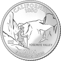
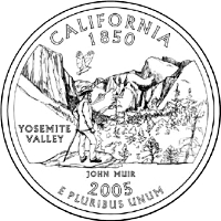
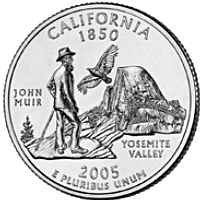
Despite such admonitions to keep it simple, when the Mint returned Burke's design to the new governor — Arnold Schwarzenegger had replaced Davis following a recall election — the Mint had added what it described as a California condor, and had cluttered Yosemite Valley with highly detailed flora.
Now Schwarzenegger had to choose. Would he pick the Golden Gate Bridge to represent California? Would he go with the people's choice in the online poll and select the gold prospector? Hollywood icons hadn't made the cut; the CCAC was recommending a stylized sun and ocean waves.
The new governor picked none of these. The Sierra Club was lobbying for Burke's John Muir design, and here was a politically painless way for the Hummer-driving governor to appease the environmental community.
Schwarzenegger reportedly felt the Mint had made Burke's image "too busy" by adding all the plant life and asked Mint to (re-)simplify it. The result was a triangular arrangement with Muir at left, Half Dome at right and a truer condor at the top. Gone were El Capitan and the waterfall; gone, too was the cohesiveness of Burke's original concept.
"When you think about it," said a magnanimous Burke, "the three separate images express one thought. It's man, animal and nature together."
"I actually liked it [the final version] because it simplified it," Burke said. "Don Everhart at the Mint sculpted it and Al Maletsky reimagined it. ... They're the experts, not me."
Both Everhart and Maletsky are veterans of The Franklin Mint. Today The Franklin Mint belies its name as a mass marketer of kitchy, imported "collectibles" that it peddles online and through monthly credit-card statements and Sunday magazine supplements. But in the mid-1960s, when silver coinage was withdrawn from circulation and Las Vegas needed gambling tokens, Kennedy half dollar creator Gilroy Roberts left the U.S. Mint and built the company into the world's largest private coiner.
In the 1990s, when The Franklin Mint quit making foreign coins, medals and ingots ("art bars"), some of its displaced sculptors found a home down the road in Philadelphia. The Gilroy Roberts tradition had come full circle.
In 1989, T. James Ferrell moved from The Franklin Mint to the U.S. Mint, where he designed several collector coins and engraved five state quarters. His last was the 2004 Florida quarter, which he executed in much the same manner his colleagues would later "reimagine" California's.
Florida artist Ralph Butler tied the state's past with its future: a Spanish galleon (for the first European settlers) arriving at a palm tree-studded spit of land, overflown by a space shuttle. Cumulous clouds bound the disparate elements together as a single idea.
When he selected Butler's design as one of five finalists, Florida Gov. Jeb Bush said that "no matter which one ends up on the back of the quarter, Florida will have the best quarter." But when the Mint revised it for "coinability," it removed the clouds, eliminating the idea of linkage, and downscaled the three elements, rendering them as separate triangle points.
At a glance (which is all that can be expected of the average user), the galleon and the shuttle are unrelated icons. Only upon verbalization (a second stage of thought) does the relationship between "ship" and "spaceship" become clear.
Floridians must be pretty good thinkers, because the design won an Internet and mail-in poll with 123,515 votes, or 29 percent, followed by the Castillo de San Marcos in St. Augustine, at 25 percent, and a heron standing in the Everglades, at 22 percent.
Notably, Ferrell also sculpted the state quarter that is most often cited as a true work of art: Connecticut's Charter Oak, the fifth coin in the series (1999), based on an original design by art instructor Andy Jones of Hampton, Connecticut. (Ferrell and Maletsky have left the U.S. Mint; of the Mint's five current sculptor-engravers, three are from The Franklin Mint factory.)
"I've always liked Connecticut with the old oak tree. I think it's a pretty design," said Congressman Castle, who is also partial to his home state coin, the Delaware quarter, featuring Caesar Rodney's 80-mile ride to cast the deciding vote for independence in 1776.
"The ones I like the least," Castle said, "are the ones where they try to do too much, [where they have] something in the sky, something in the background, something in the foreground."
"I've never taken them out and examined them all together to see which I like the best," Castle said.
We'll leave that to our numismatist of the future.
©2005 MILLER MAGAZINES INC./LEON WORDEN. ALL RIGHTS RESERVED.
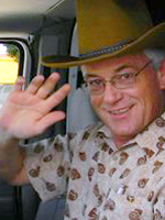


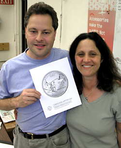 Garrett Burke, left, came up with the original concept for the California quarter. His wife, Michelle, right, a coin collector, told him about the design contest.
(Photo: